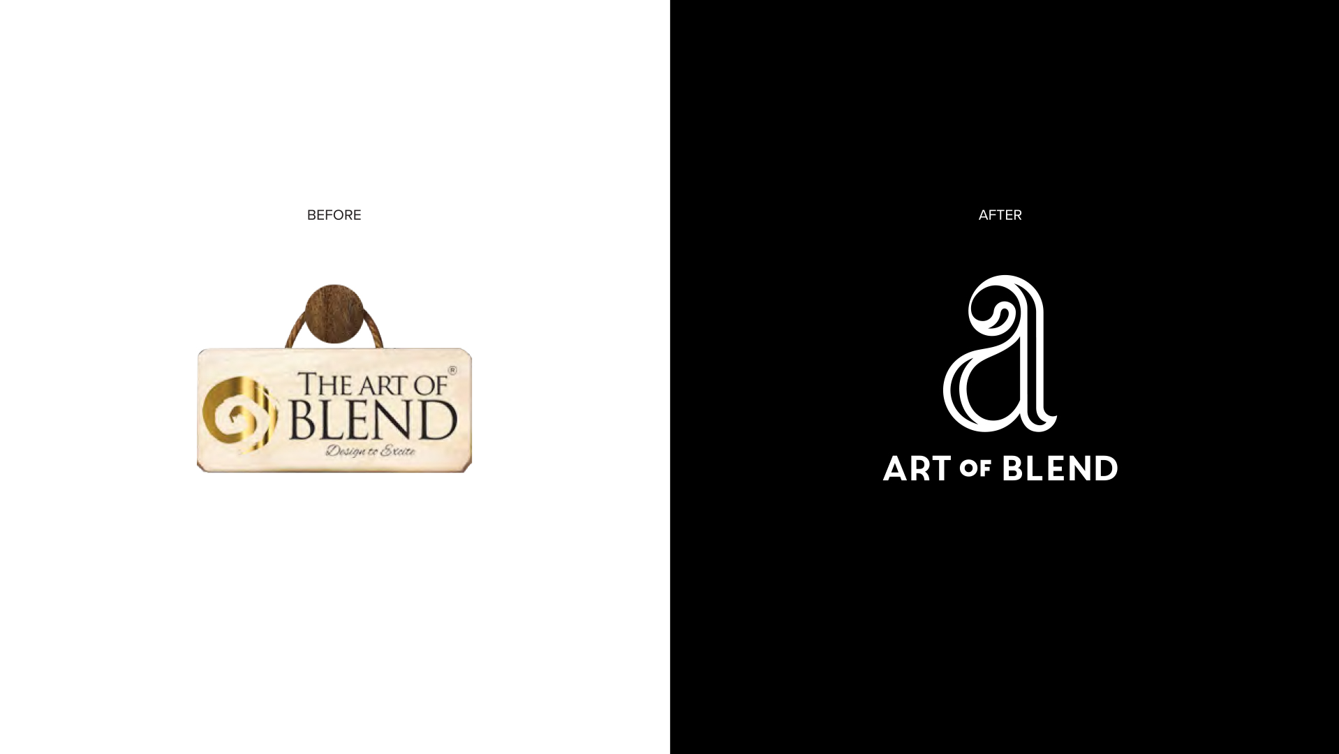
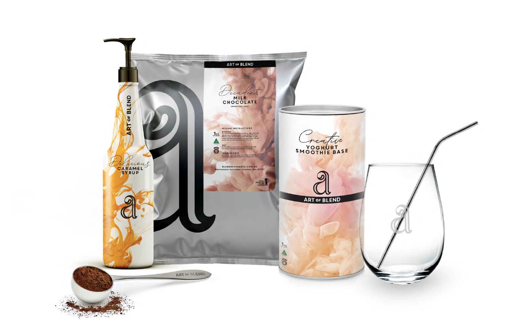
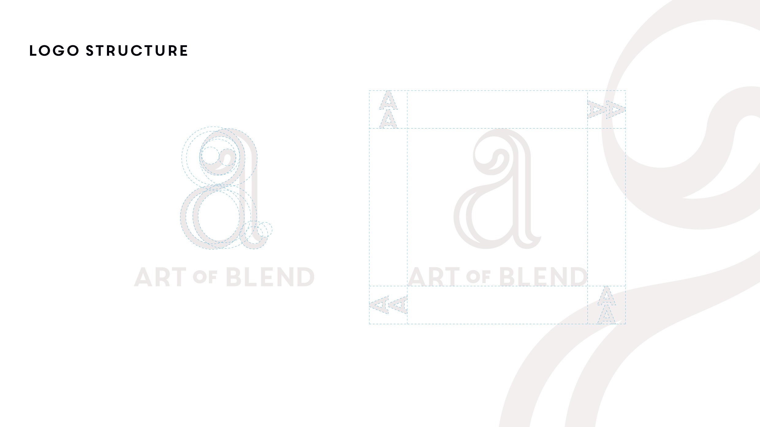
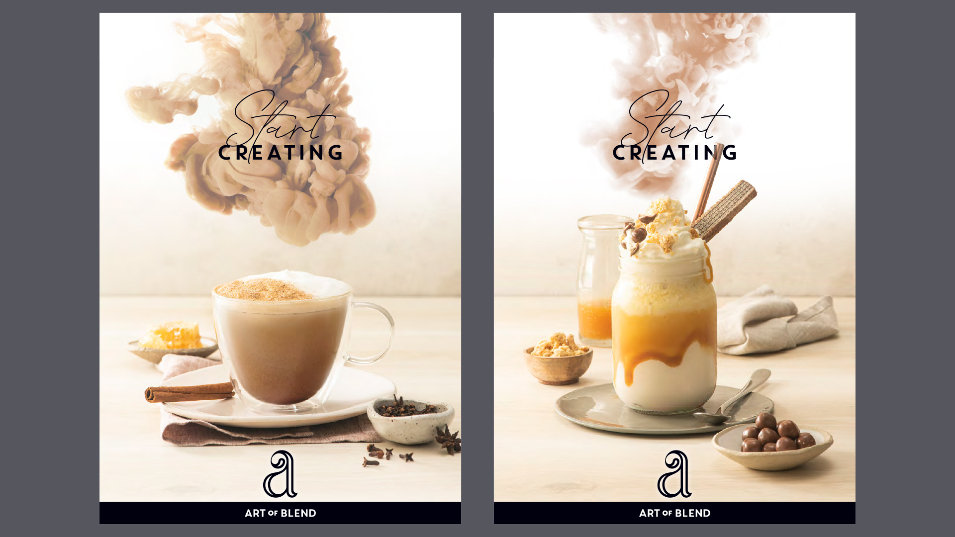
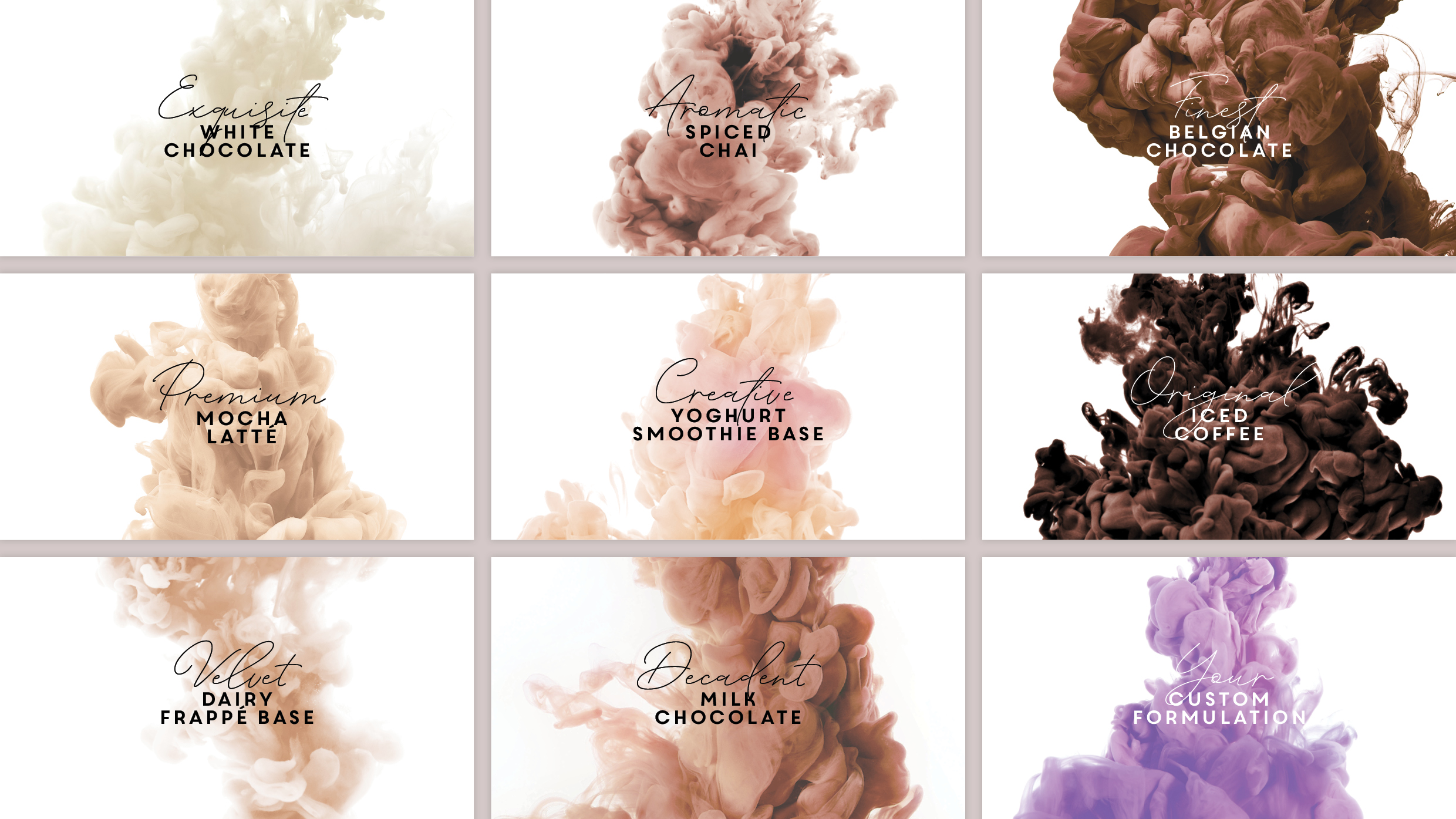
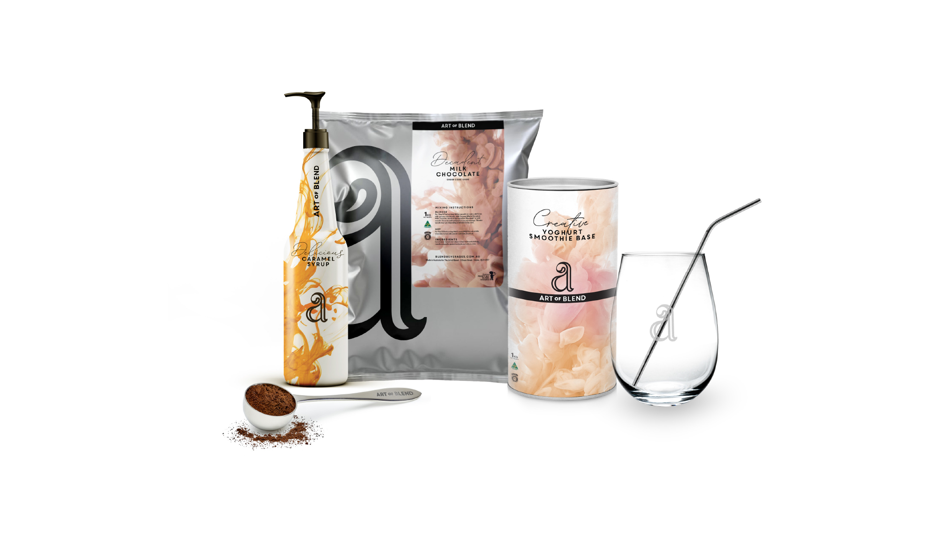
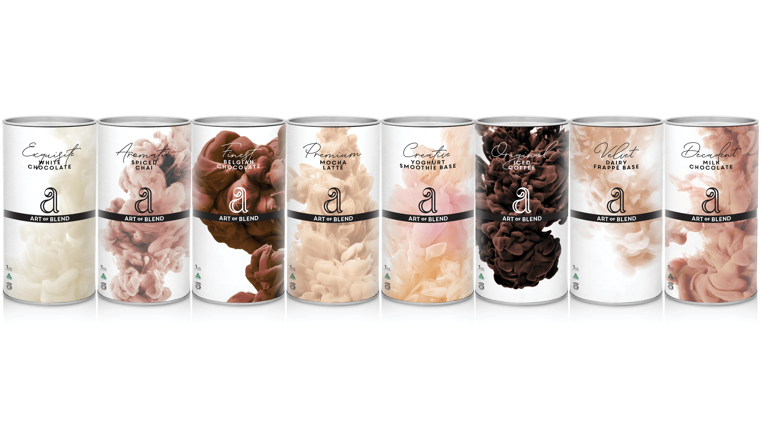
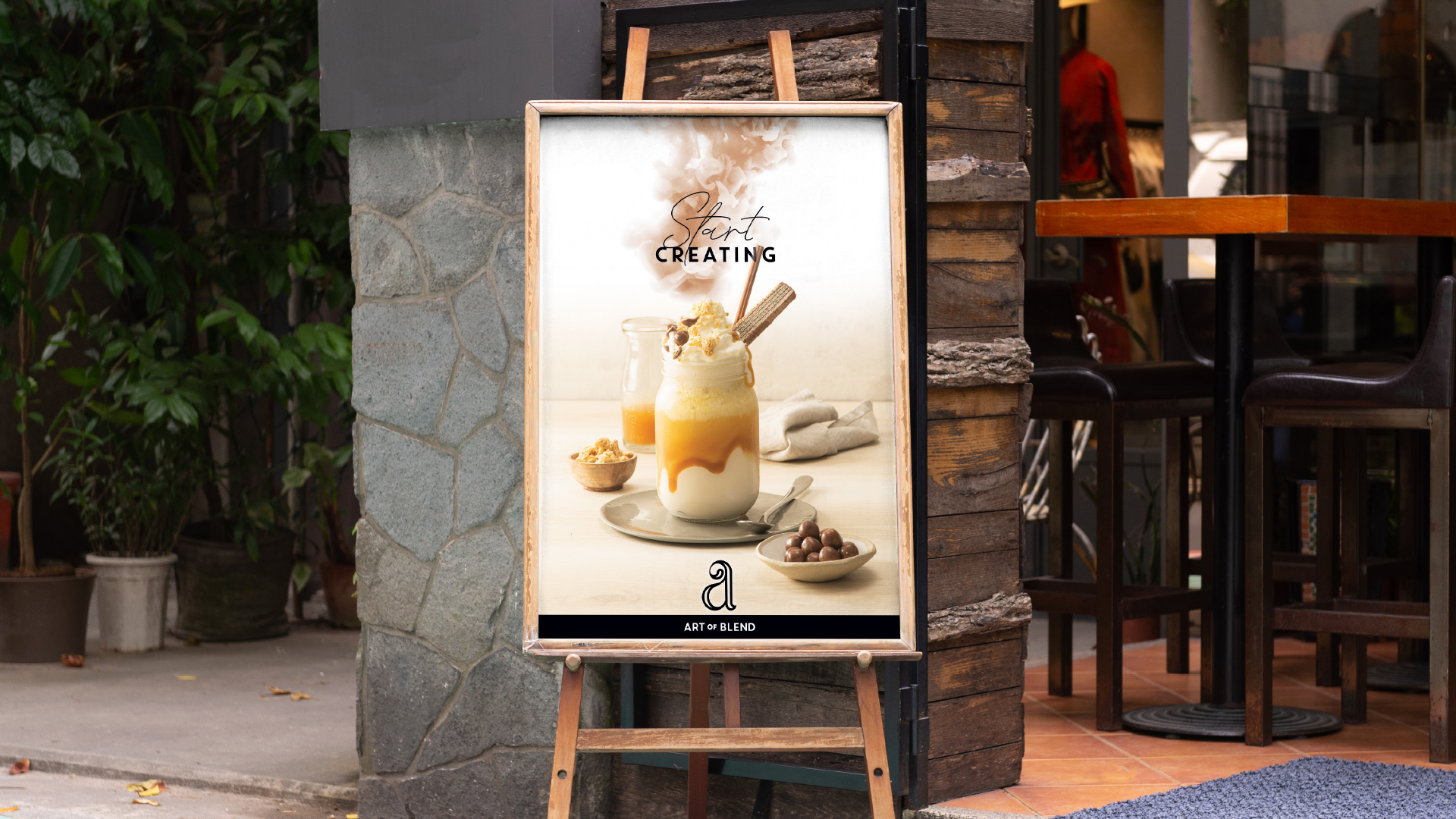
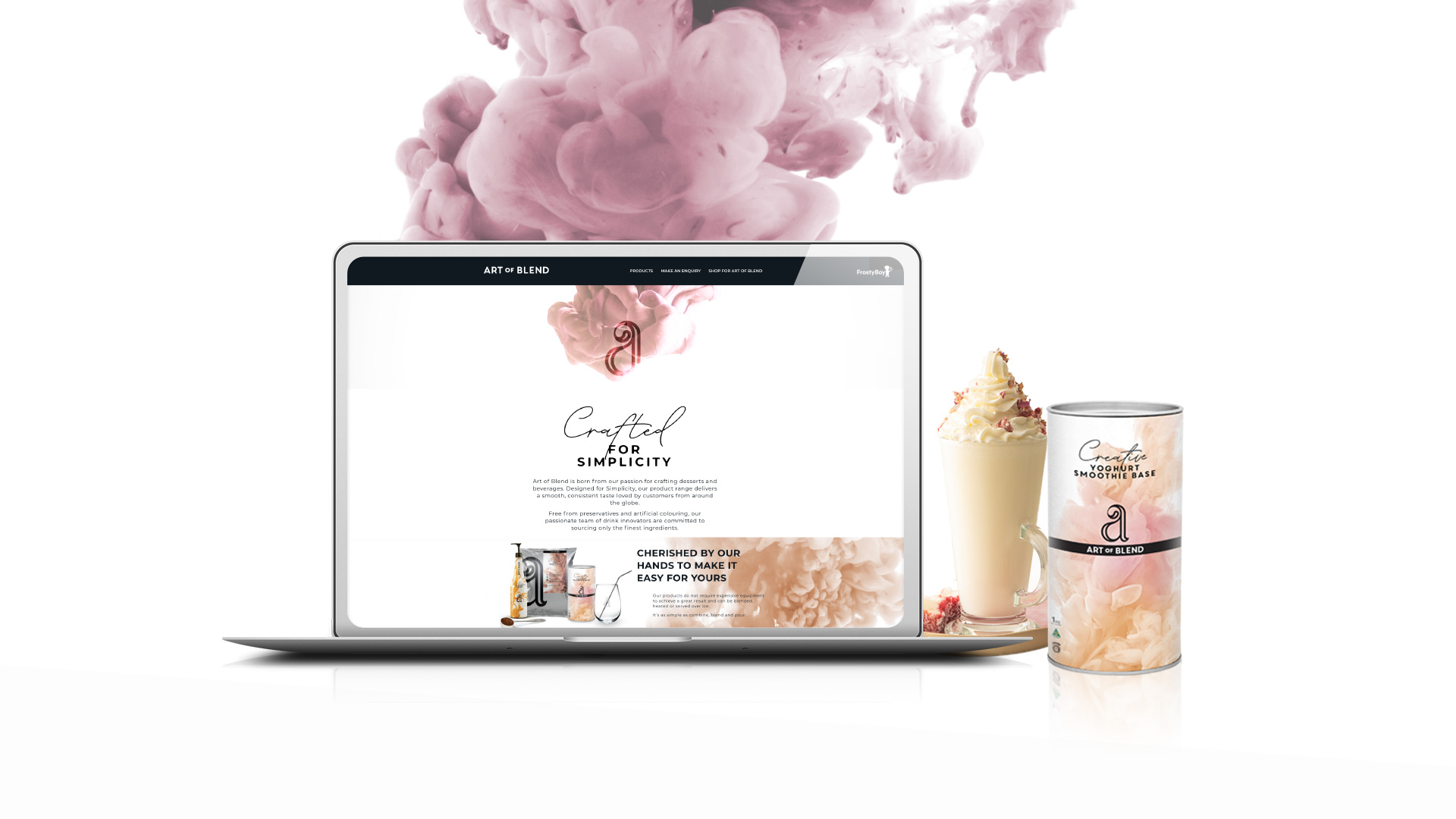
Art of Blend knew they had to modernise and elevate the brand by developing a new brand positioning and visual identity that would clearly differentiate from competitors. A crafted lettermark which included a hidden and subtle ‘swirl’ supported by clean type form the primary logo. This was then placed over imagery of the product at the very moment it is mixed with liquid: The way the product is mixed now forms the artwork for the brand and even allowed us to create a striking piece for each flavour. The vivid clouds and syrup streaks also hint at the many possibilities the user has when creating with Art of Blend. It inspires and invites the user to create their own masterpieces.
Project deliverables:
- Branding
- Brand style
- Brand Guidelines
- Packaging Design
- Motion Graphics
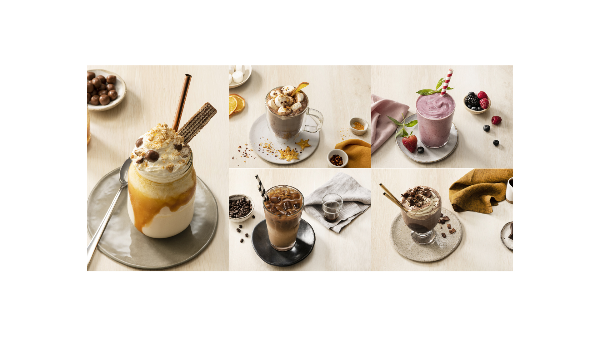
- Photography direction
- Art Direction
Project worked on at Brother & co.

